Albania
 Argentina
 Australia
 Austria
 Belgium
 Bosnia and Herzegovina
 Brazil
 Bulgaria
 Canada
 Chile
 Colombia
 Croatia
 Czech Republic
 Denmark
 Estonia
 Finland
 France
 Germany
 Greece
 Hungary
 Ireland
 Italy
 Latvia
 Lithuania
 Luxembourg
 Mexico
 Moldova
 Montenegro
 Netherlands
 New Zealand
 North Macedonia
 Norway
 Philippines
 Poland
 Portugal
 Romania
 Serbia
 Slovakia
 Slovenia
 South Africa
 Spain
 Sweden
 Switzerland
 Turkey
 Ukraine
 United Kingdom
 United States of America


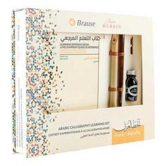
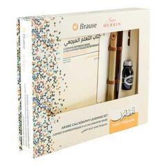
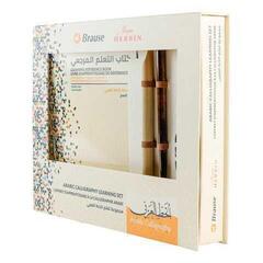
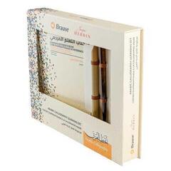
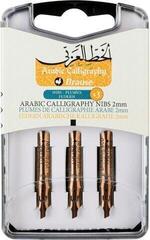
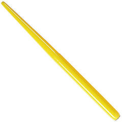
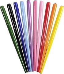
Calligraphic Pens
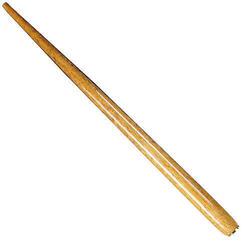
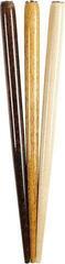
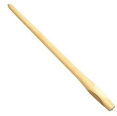
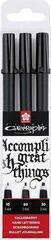
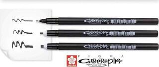
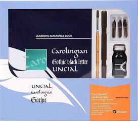
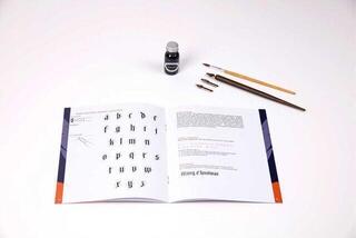
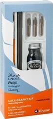
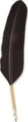
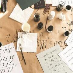
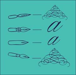
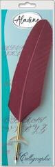
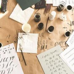
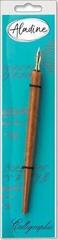
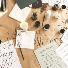
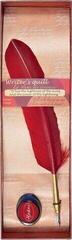
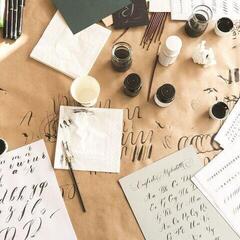
A calligraphy pen creates the character of lettering through a combination of nib shape, stroke direction, pressure, and the ink used. A beginner does not need the largest set, but a well-matched pen, paper, and ink. A broad nib, flexible dip nib, and brush pen work in different ways. Choose according to the lettering size and whether you want contrast based on angle or pressure.
A broad nib maintains a consistent angle
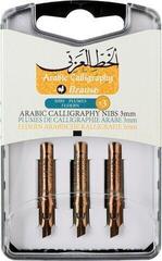
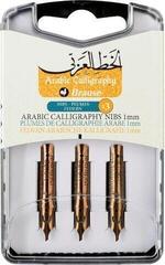
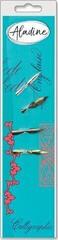
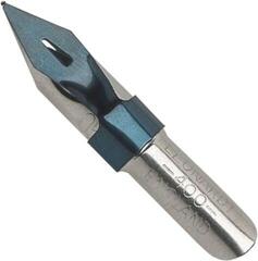
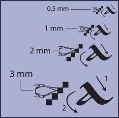
Line width is created by the angle of the edge relative to the direction of movement. You do not need to press hard; maintaining the same angle in both vertical and horizontal strokes is more important. A broader size suits larger letters and clear contrast, while a narrower one is suitable for smaller text. For practice, first draw a series of parallel lines and curves so your wrist learns to maintain a consistent angle.
A flexible nib responds to pressure
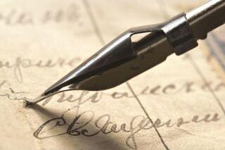
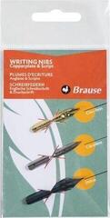
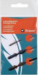
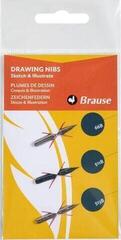
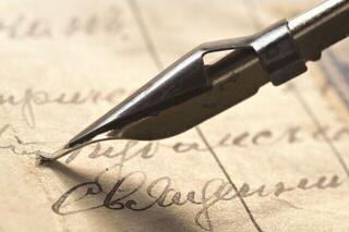
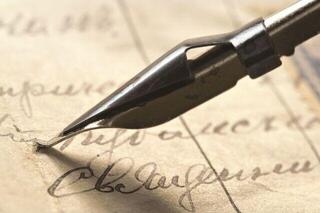
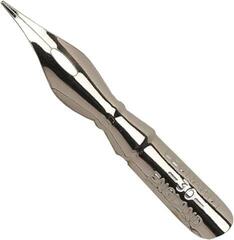
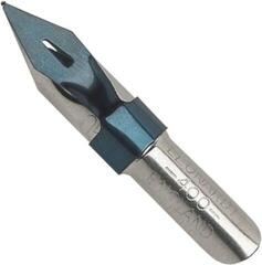
A dip nib opens under pressure to create a wider stroke and returns to a thin line when the pressure is released. Add pressure only in the direction in which the nib glides safely; pushing against the point can catch the paper or splatter ink. Prepare a new metal nib according to the manufacturer's instructions and do not immerse it in ink above the recommended level while working.
The ink must suit the pen system
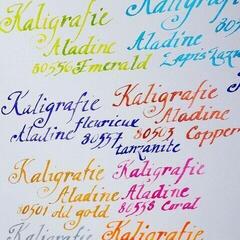
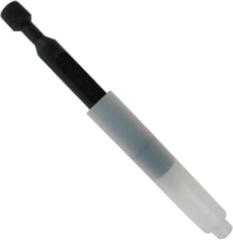
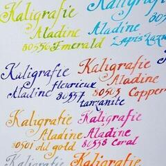
Not every calligraphy ink is suitable for a fountain pen. Pigmented or thicker inks may be intended only for a dip pen or brush. In a cartridge pen, use only compatible ink specified by the manufacturer. Inks are suitable for colored washes and separate brushwork, but always check whether they can be used in your specific pen.
Paper determines how sharp the edge is
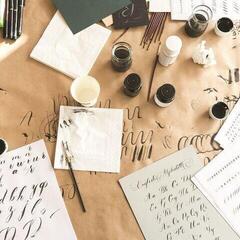
Overly absorbent paper draws ink into the fibers and makes fine lines feather. Very smooth paper may extend drying time and increase the risk of smudging. A test on the last page or a scrap reveals bleed-through, feathering, and drying time. Place clean paper under your hand so oils from your palm do not alter the working surface.
Choosing a tool by style
| Calligraphy tool | Source of contrast | Typical use |
|---|---|---|
| Broad nib | Edge angle | Structured historical scripts |
| Flexible nib | Changing pressure | Fine lines and pronounced downstrokes |
| Brush pen | Flex of the brush tip | Modern lettering and practice |
| Monoline pen | Consistent width | Sketching, letter structure, and simple lettering |
Cleaning prevents ink from drying on the nib
After use, rinse a dip nib using a method suitable for the ink and dry it thoroughly to prevent corrosion. Flush a fountain pen system only according to the manual and without harsh products. Replace the cap before the ink begins to thicken on the tip. The Calligraphy category brings together more lettering and drawing tools.